Mona Lisa Smiles

Fig. 1, Mona Lisa http://www.shawnsmallstories.com/wp-content/uploads/Mona-Lisa-Framed.jpg

Fig. 1, Mona Lisa
http://www.shawnsmallstories.com/wp-content/uploads/Mona-Lisa-Framed.jpg

Mona Lisa (Fig. 1), the most famous painting of the Renaissance period. “It was painted by the Leonardo Da Vinci, the famous Italian artist, between 1504 and 1519, and is a half body commission for a woman named Lisa Gherardini.”(Totally History) This icon of the art history has amazed thousands people around the world. But how is it related to Graphic Design?

Mona Lisa has very complicated structure if we look at the composition of the painting. It is structured geometrically and follows some of the rules. Leonardo Da Vinci applied the rule of Archimedes spiral (Fig. 2) in order to build up the composition of the body.

It is amazing, how an artist can structure his artwork using maths. If so, are there any other secrets hidden in this painting? Is there worlds famous “Da Vinci Code”?

One of the hidden meanings I found fascinating was that the painting is split in four nature forces: earth, fire, water and air (Fig.3). In the order mentioned above you can follow the painting seeing all four. I have seen this painting hundreds of times, but never thought it is so full secrets, and this really inspires me to do my designs with a twist of mystery in them.
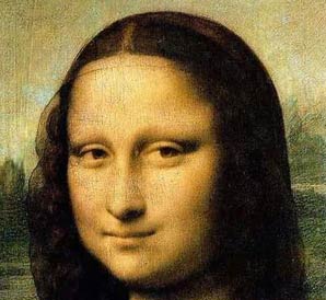
Another mystery of the painting is Mona Lisa’s smile. In combination with unforgettable eyes it has inspired thousands of artists, writers and musicians. I would call it an honest smile, in most cases people do this kind of smile for themselves, very deep and true, without overdoing it. Probably that’s why people fell in love in it so much.

Competing love to the painting, there have been several situations when vandals tried to destroy the painting. “The first occurrence of vandalism was in 1956 when somebody threw acid at the bottom half, severely damaging the timeless masterpiece. That same year, another vandal threw a rock at the work, removing a chip of paint from near her elbow. It was later painted over. Afterwards, the piece was put under bulletproof glass as a means of protection has kept the painting from further attempts at vandalism and destruction.” (Totally History [WWW])
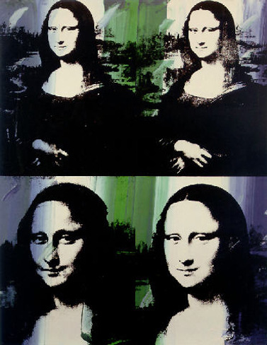
Mona Lisa has been reproduced and parodied by many famous artists such as Andy Warhol (Fig. 5), Philippe Halsman, Fernand Leger and others.

Nowadays, Mona Lisa’s identity has become a brand. Designers use their reproductions of Mona Lisa in order to produce work to be put on t-shirts (Fig. 6), posters, canvases and even promotional materials. At some point it was very popular and everybody used imagery related to this painting.

To conclude, Mona Lisa is inerasable spot in the art history. Being a hot topic of discussions, it has gained an amazing popularity around the world. If you still haven’t seen it in real its worth of visiting Louvre in Paris. Personally I have not been there yet, but my dreams might get true soon. Can’t wait!

____________________________________________________________________________________________________

References:

The Guardian [WWW] Available from: http://www.theguardian.com/artanddesign/jonathanjonesblog/2012/oct/04/mona-lisa-leonardo-painting  [Accessed 15/11/13]

Live Science [WWW] Available from: http://www.livescience.com/4648-25-secrets-mona-lisa-revealed.html [Accessed 14/11/13]

Smart History [WWW] Available from: http://smarthistory.khanacademy.org/leonardo-mona-lisa.html [Accessed 15/11/13]

Totally History [WWW] Available from: http://totallyhistory.com/mona-lisa/ [Accessed 16/11/13]

Telegraph [WWW] Available from: http://www.telegraph.co.uk/culture/art/art-news/8249386/Mona-Lisa-landscape-location-mystery-solved.html [Accessed 15/11/13]

McMullen, R. (1976) Mona Lisa: The Picture & The Myth. Houghton Mifflin Company, Boston

British Design And Postmodernism

In April 2012 I have visited probably the most breathtaking and amazing exhibition in my life. The exhibition took place in Victoria & Albert Museum in London and was called simply British Design. The exhibition traces the changes in design of the period from 1948 – 2012 by exploring ideas, images, fashion and architecture based in Britain. In my opinion this exhibition has a mark of postmodernism on it as most of the designs exhibited were produced particularly in the time period when this style was dominant.

“The first use of the term “postmodernism” is before 1926, and extends to the 1870s, when it was used by the British artist John Watkins Chapman.”  (Appignanesi and Garratt 1999  pp.3)

“Posteriority”, the negative feeling of coming after a creative age or, conversely, the positive feeling of transcending a negative ideology, really develops in the 1970s, in architecture and literature, two centres of the postmodern debate.” (Appignanesi and Garratt 1999 pp.3)

Coming back to the exhibition, I would like to say that it really inspired me and helped me while I was working on my project related to British design and postmodernism. Despite of being graphic designer, I found fashion and fabric prints the most interesting for me.

I was very impressed by tulle dress designed by Hussein Chalayan. This dress is breathtaking and unique.  Large, bleeding tulle egg probably has thousands metres of fabric in it. Red colour sort of fades out and gives fascinating effect.

Fig. 3, Factory Club  Poster by Peter Saville http://www.cerysmaticfactory.info/images/fac1posterdetail.jpg

Fig. 3, Factory Club Poster by Peter Saville
http://www.cerysmaticfactory.info/images/fac1posterdetail.jpg

As a piece of graphic design I can highlight the Factory Club Poster by Peter Saville. The design is very obvious, based on the look if BSI work-site hazard warning signs and it firmly established one of Factory’s multifarious designs remits.

Fig. 4, God Save the Queen Sex Pistols poster by Jamie Reid http://lewebpedagogique.com/anglaisfastoche/files/2013/09/god_save_the_queen_poster.jpg

Fig. 4, God Save the Queen Sex Pistols poster by Jamie Reid
http://lewebpedagogique.com/anglaisfastoche/files/2013/09/god_save_the_queen_poster.jpg

I think, the most famous work on that exhibition was world’s famous God Save the Queen poster for Sex Pistols designed by Jamie Reid. It is very simple and effective design copied and reproduced millions of times becoming a brand identity of British design and Sex Pistols as a band. Nowadays it’s being printed on lots of different souvenirs and canvasses.

British design exhibition has opened my eyes to the new dimensions of art and culture in Great Britain.  Genius ideas, fascinating designs and amazing historical treasures all in one place are able to make happy and inspired any visitor of this lovely show. I remember myself drawing some of the pieces as we were unable to take photos, so much exited I was. If I had a chance, I would definitely visit this exhibition again as it is going on every year. London! Here I come!

_______________________________________________________________________________________

References:

Appignanesi, R. and Garratt, C. (2003)  Postmodernism. A graphic Guide. Penguin Books Canada

Heartney, E. (2001) Postmodernism. Tate Gallery Publishing Ltd, London

Victoria and Albert Museum [WWW] Available from: http://www.vam.ac.uk/content/exhibitions/exhibition-british-design/british-design-about-the-exhibition/ [Accessed 10/12/2013]

Apple vs. Samsung

Apple vs. Samsung

For more than four years two competing companies Apple and Samsung are fighting against each other because of the patent violations. The fight began last year when Apple sued Samsung in a US federal court, accusing the South Korean company of “slavishly” copying the iPhone and iPad. Samsung countersued.

“The fight began last year when Apple sued Samsung in a US federal court, accusing the South Korean company of “slavishly” copying the iPhone and iPad. Samsung countersued.” (PCPro 2013)

In my opinion, Apple is number one on the technology market and I believe that any patent violence causes incredible money loss to the company. As far as I know Apple came to the technology market with absolutely unique and innovative concepts. Company has put on the side all the leading competitors and became number one in the world. This is why I think that Apple in particular is not able to break any copyrights or patents. It has its own point of view and concepts as well as originality, so they do not really need to copy anyone.

Let’s have a look at designs from both companies.

The Apple iPhone (L) and the Samsung Galaxy S. In fact, they look pretty much similar, I’d same they are same. First of all you have to say that their shapes are absolutely identical. A rectangle with rounded edges and a metallic stroke around. Ear speaker is very similar and interface is absolutely identical. However, Samsung screen is a bit longer and it has different home button shape as well as two more sensor buttons on the both sides which is different from an iPhone. Samsung’s got front camera, which appears on iPhone only few models later. Isn’t it interesting?

This is why judges refused Apple appeal to ban those products as well as award the compensation for the iPhone maker.

Just another short look on the tablets.

Despite of them two being in two different colours, they are absolutely the same. The only difference is in the size proportions (Samsung tablet is longer, when Apple one is wider). Similar interface and  buttons as well as silver border around the devices. Considering the fact that iPad is slightly older that Samsung Galaxy Tab I am more than sure that it’s been copied causing so many problems with the patent violence between Apple and Samsung.

At the moment, there are few more cases going on between world’s leading gadget producers. One of them is regarding current iPhone 5 series, where Samsung think that Apple copied their ideas. In my opinion, Apple is right in most the cases, because as we can see Samsung really copied their designs making Apple to lose sales of their devices. If we think logically, if two devices are very similar, people would go for the cheapest, in this case Samsung wins, but Apple loses billions. In fact, no one can beat Apple in its quality and originality. This is why it’s the best in the world!

__________________________________________________________________________________________________

Refferences:

The Wall Street Journal [WWW] Available from: http://online.wsj.com/news/articles/SB10001424052748703916004576271210109389154http://www.bbc.co.uk/news/business-13124753  [Accessed 9/12/2013]

The Guardian [WWW] Available from:  http://www.theguardian.com/technology/2012/oct/18/apple-samsung-advert-cool  [Accessed 9/12/2013]

Ubergizmo [WWW] Available from: http://www.ubergizmo.com/2011/09/apple-sues-samsung-in-japan/ [Accessed 9/12/2013]

Huff Post [WWW] Available from: http://www.huffingtonpost.com/2013/11/15/apple-samsung_n_4284320.html [Accessed 9/12/2013]

Pc Pro [WWW]  http://www.pcpro.co.uk/news/376123/apple-vs-samsung-the-latest-news-from-the-patent-battle [Accessed 9/12/2013]

Herb Lubalin. More than a type

Herb Lubalin. (Fig.1) Art director, graphic designer and typographer. People describe him as “skinny, colour blind, left handed artist who didn’t speak much.”(Snyder and Peckolick, 1981)  Doesn’t sound like an interesting person who talk about, right? However, the twist he puts in his work is incredible!

Herb Lubalin was “a non-verbal designer fascinated by the look and sound of the words, and he expanded on their message with typographic impact.” (Snyder and Peckolick, 1981)

“Herbert was a good art student in high school, despite of inability to draw recognizable images. His teacher encouraged his feelings for design and lettering, knowing one can develop as an artist without relying on drawing accurately.”

Fig. 2, Ad designed for Wm. S. Merrell Company by Herb Lubalin, photo by Carl Fischer, 1954
http://www.creativereview.co.uk/images/uploads/2011/10/lubalin_spasm_0.jpg

He puts into typography more than obvious, adds a feeling to it and makes the words read as they sound. Being playful in anything, he uses every day’s objects in order to bounce off the ideas. That’s how one of his most memorable campaigns was developed, while he was working for Sudler & Hennessey, an advertising agency which specialised in pharmaceutical marketing. The ad featured a drug to counteract muscle spasm. “He came to the office with a Slinky, a coil-like toy that could ‘walk’ down stairs, slither across the floor and tumble end over end.” Lubalin found its moves related to a human muscle movements. That’s how the Spasm Campaign was created.

Working in U&lc (a trade newspaper for the typographic industry) he was very strict and always got the things done exactly the way he wanted. He used to sketch his layouts very roughly and basic, (Fig. 3) passing them to the other designers to put the whole thing together. Herb was an idea man, he was not a good drawer, but he knew how he wants it to look like. In my opinion, it is the most important thing for an art director. For this job you have to think of the concepts and layouts, when the ‘dirty’ work is being done by the designers.

One of the most popular publications Lubalin was working on is Avant Garde. (Fig.4) “Lubalin’s starting points were capitals in the style of a geometrical sans-serif typeface (known in the USA as a “Gothic”), something between Futura and Helvetica.” This font became the most successful typeface of the 20th century, being abused by the other designers as they used it not in the right way. Professionals used to say “The only place Avant Garde looks good is in the words Avant Garde.” I find this typeface distinct, considering the historic period if its discovery. This typeface influenced many designers and still is widely used in design.

Fig.5, Spencerian script lettering by Herb Lubalin
http://www.eyemagazine.com/feature/article/up-close-and-tight

“Lubalin was best known for his Spencerian script lettering, (Fig. 5) a style which is often incorrectly referred to as calligraphy.” (Snyder and Peckolick 1981) It is developed in sketch form and drawn with a croquil pen. It could take up to ten sketches before Herb was absolutely happy with the design, then it was taken to finest hand-letterers such as John Pistilli, Tom Carnase or Tony Di Spigna.

_____________________________________________________________________________________________

Refferences:

100 Best Typefaces [WWW] Available from: http://www.100besttypefaces.com/23_Avant+Garde+Gothic.html [Accessed 10/11/2013]

Gertrude, S. and Peckolick, A. (1985) Herb Lubalin, Art director, Graphic Designer and typographer. Amshow & Archive

Eye Magazine [WWW] Available From: http://www.eyemagazine.com/feature/article/up-close-and-tight [Accessed 10/11/2013]

My Approach to Graphic Design

In my opinion, Graphic Design is random, unexpected and accidental. It all comes from the development process which is the most important phase, I’d say. During the process of development you discover something new while repeating all obvious things and testing something new. You play around and test to get something unique.

For me, this process starts from idea generation. It’s normally a spider diagrams (Fig. 2) what we all used to do from the very start of being designers. I used to generate ideas using the same method, but I didn’t enjoy it as much, to be honest. I was struggling to get something unique out of it getting most obvious things on the page. It was upsetting and I didn’t enjoy the project at the first stage already.

Fig. 3, Graphic Design Basics – Idea Generation
http://media.bloomsbury.com/rep/bj/9782940411818.jpg

Recently I found an amazing book by Neil Leonard and Gavin Ambrose called Basics Graphic Design – Idea Generation. I think it’s a masterpiece! In this book they speak about basic principles of idea generation. Using their suggestions I started to use a different approach to my idea generation. First, I get down everything that comes in my head, even the most silly and obvious ideas. I use imagination in order to find associations to the words and phrases I got at first, this is giving me something different and less obvious. Then I repeat all this for about two times until I come up with something unique and interesting. At this stage I go back to the topic and see how I can apply my ideas to it. The result is fantastic! I have really improved my idea generation “tool” in my brain, and it’s so easy!

Good idea isn’t enough to produce a masterpiece, that’s why you have to think of visualizing your idea. I usually start with mood board as well as “visual dump” which is kind of same things. I just get down in my sketchbook all possible imagery, words, typography, drawings, annotate them, look and analyse. These “visual dumps” are influencing my visual imagination and help to design layouts and imagery.

Testing is the worst part for me, because I find it a bit too boring, because you sit there and try to get the design you are happy with and it is not so easy, because in most cases you do simple and boring crap. And this is a problem for me. I like to be safe and use simple layout which came in my mind, dropping out anything different. Nobody said that simplicity is bad, but I think I should go over this problem and start being more risk taking.

The last stage for me, as for all the designers, is when you polish your final piece. Even a small change can make a massive difference in your work, and that’s been proven to me while I was doing my work experience in a print company. The success has three stages: good idea, range of tests and final piece!

References:

Leonard, N. and Ambrose G. (2012) Graphic Design Basics – Idea Generation. AVA Publishing

My Blogging Experience

“Blog – a personal website or web page on which an individual records opinions, links to other sites, etc. on a regular basis.” (http://oxforddictionaries.com/definition/english/blog)

Basically, blog is interest themed informational website, where the author regularly posts news, articles or images. In most cases blog is informal and private. It repeats or follows newspapers and magazines, sometimes presenting web news as well as TV programmes and films.

Fig. 28, Diary

http://4.bp.blogspot.com/-D84Fs5t3Ydg/USQjZxxvUKI/AAAAAAAADOg/4Yocid1ZBCI/s1600/diary+copy.jpg

Blog can be as a diary, where you share your thoughts and experiences, possibly your art work or anything else you are keen on.

Fig. 29, Online Social Networks

http://comerecommended.com/wp-content/uploads/2011/11/online-social-networking-21.jpg


I found it very interesting that most of the social networks obtained blog form. People share information, anything they like or do in their spare time. Places like TwitterFacebook and Google+ are using live feeds where you scroll down the pages to see what people are looking at and what do they think about particular themes and subjects. In my opinion it is a very good system of information share as your friends can be interested in the same things you do, and upside down.

I am not very active blogger, but I use social networks to keep in touch with my friends and this is where I get all information what they are doing.

I used the my blog to reflect on projects in the college and I found it interesting, because it looks better than sketchbook and is more organized and clean. You can easily access the blog and you will never physically lose it, so this is benefit of the blog.

Fig. 30, Worst Blog Ever

http://womenonthefence.com/wp-content/uploads/2012/04/worst-blog-ever.jpg

My latest blogging experience I would rate as average, because I enjoyed using reference system, read books and discover new things and themes I could use in my future projects. In fact, I did not like the actual blog on Blackboard. First of all it is boring and basic, you cannot add any themes or designs to it apart typography. The blog itself is bugged and it appearance could be better.

In my opinion, I did alright this time and my blog is formal enough to go on any website or to be publishes, I tried to keep semi-formal style so that people reading it don’t fall asleep. I would like every blog to be interesting and exciting to read, with nice design and good images or videos.

“I think the pleasure of completed work is what makes blogging so popular. You have to believe most bloggers have few if any actual readers. The writers are in it for other reasons. Blogging is like work, but without co-workers thwarting you at every turn. All you get is the pleasure of a completed task.” (Scott Adams)

I totally agree with Scott Adams, you can have none subscribers, but you still write. Write because you like and if it is a pleasure for you, you will do it again and again. On the other hand, if it was me, I would like my work to be seen, you never know if you are so talented that you might become famous blogger like Jenna Marbles, for example.

________________________________________________________________________________________________________________________________________ 

References:

Blog Quotes [WWW] Avaliable from: http://www.dailyblogtips.com/blogging-quotes/ [Accessed 15/04/2013]

Oxford Dictionary, Blog Definition [WWW] Avaliable from: http://oxforddictionaries.com/definition/english/blog [Acessed 15/04/2013]

Typographica

Fig. 21, Typographica website header, Screen shot

http://www.typografica.com

Typographica – www.typographica.org

Graphic Design is not only fancy pictures put together in a particular way. You can’t have unexplained images unless they are narrative, telling a story. In a modern world I can’t imagine a design (poster, flyer, book cover or anything else) without typography.

Fig. 22, Typographica website image, Type of 2012

http://typographica.org/

Typography is selection of letter forms ready to be organized into words and sentences and disposed in blocks of type for print. Typographic unit is called “Font”, this means that the style of the letters should be similar.

Fig. 23, Ancient Script

http://plus.maths.org/content/light-attenuation-and-exponential-laws

Typography has been developed since ancients script time as well as cave drawings – they were typographic units too. Over the years there were developed thousands and thousands different fonts. There were so many scripts that they had to be grouped and arranged.

Typographica – the blog I found most interesting for myself. It has great collection of all possible typographic elements. The blog itself reviews typography, talks about development of it as well as where it is being used and how effective or not it is. Another good feature of the blog is that it reviews books related to typography. Some of them I would like to have a look at as the reviews are very interesting and books seem to amazing.

Fig. 24, Typographica website menu

http://typographica.org/

Let’s talk about navigation of the website and its design. The design is very simple, and I don’t really want to focus on it so much. All I can say is that it is easy to use and it is good-looking. Things I found useful were the actual resource arrangement. All typefaces are organized by year, designer, foundry and classification. It means you can easily find stuff you could be interested in. You can either look for a designer or classification if you want to find a font you need to research on or even use.

Fig. 25, Typographica, Screen shot

http://typographica.org/

There is a commentary section, wherepeople discuss typography or anything they were keen on selected topics. You literally can scroll down for ages reading the comments and discussions and you can see there many professional designers speaking up for the type. It is very useful for us, beginner designers to see what they think and what industrial opinion is like.

Fig. 26, Typographica, Screen shot

http://typographica.org/

Fig. 27, Chromeography, Screen Shot

http://chromeography.com/

There is a tiny section at the bottom of the blog which is under “Elsewhere” title. There are four amazing links to the websites about typography, which I found even more interesting than the actual blog. My favourite link is Chromeography which is a huge selection of lettering on vintage cars, appliances and other objects. In my opinion, every good blog should have these useful website links as they help a lot if you a researching, for example.

Overall, I would like to say that Typographica is very interesting and useful website for those interested in type, or it can even be amazing resource or reference material, because the quality of the reviews and resources is very high. I will use this blog as a reference in my future projects and soon I might be on their page. Do you think I can?

_________________________________________________________________________________________________________________________________________

References:

I Love Typography [WWW] Availiable: http://ilovetypography.com/ [Accessed 06/04/2013]

Typografica, Typography blog, [WWW], Availiable from: http://typographica.org/ [Accessed 05/04/2013]

Contos Eroticos

Fig. 15, Juan Carlos Pimenta, Contos eróticos (Erotic Stories), 1979. Courtesy of Gráfica Latinoamericana Siglo 20-21.

http://artdistricts.com/wp-content/uploads/2010/05/1-pimenta_contos_eroticos.gif

“Attending a show on contemporary Latin American posters is a rather unusual experience. After the mid-sixties and early seventies, posters all over the world lost a great deal of their social role and their cultural and political function, as they became more and more integrated into the advertising industry. In Latin America, the vitality of posters in which Cuban designers, and Leftist movements played a major role – faded away to the extent that the fate this form of creation seems unclear today, and it is barely mentioned as a movement”. (Ernesto Menéndez-Conde, Art Districts Magazine)

Fig. 16, Added by JayTrotter, 2012

http://www.listal.com/list/amazing-underrated-obscure-bizarre-films

One of the great posters of that time is poster for a short film Contos Eroticos which “is about a man who becomes so attracted to a watermelon that he must make sweaty, dirty love to it. There is even a POV shot from INSIDE the watermelon during…it. Based on a prize-winning short story from a Playboy contest.” (Jay Trotter, www.listal.com, 2011)

The story about the love with the vegetable was banned in Brazil as being too sexually irrational.

Original poster design was creates by Juan Carlos Pimenta, also known as Fernando Pimenta. Brazilian native from Rio de Janeiro he studied in National School of Fine arts. Soon he started his career in illustration for architecture, textile, packaging and typography. He worked for various advertising agencies before taking directorship at Embrafilme and creating more than 300 campaigns for Brazilian films.

“Went to the street market and got tem watermelons, chose one, retouched and deflowered the poor thing. It took us one week to find a watermelon with uniform texture, no stains and symmetrical oval shape. Made the ‘vagina’ myself.” (Fernando Pimenta, Contos Eroticos,www.pimentadesign.com)

Fig. 17, Red and Green Complementary

http://www.kathykwylie.com/blog/wp-content/uploads/2011/11/Complementary-Red-Green.jpg

Contos Eroticos poster is made up of single image and text. Large watermelon is definitely dominating on the page and the cut out “vagina” grabs audience’s attention straight forward. Interesting is tonal complimentary with red and green colours, I think it works very well and other background would not work so well if it was white, for example. Centred symmetric oval makes it easy to put the text around it, but, in my opinion, the position and whole layout of the poster is unsuccessful.

I would like to add a bit of critique of this poster, because I think it is not layed out very well and doesn’t meet modern design standards.

Fig. 18, Ilya Nasedkin, Edited Contos Eroticos Header

Top: I don’t really like the header, it takes 3rd part of the page, but it is very light and this makes it not so visible. I like the font, but I would make it a bit thicker. Sub Header would look better if it was in all capitals, but it is designer’s choice.

Fig. 19, Ilya Nasedkin, Edited Contos Eroticos Footer

Bottom: I don’t see anything attractive in four columns which have centred line justification. The text could be split in four lines, because there is fairly enough space for the whole text to be on one line. This would improve poster’s bottom part.

Fig. 20, Ilya Nasedkin, Contos Eroticos refined poster compared with original

As a beginner designer I think these changes would improve the poster. Refinements are minimal and rought as well as images are done quickly, so quality of them drops. At least you can get the idea what I wa talking about.

Fig. 20, andyharker, The irony of the forbidden fruit, 2012

http://watumishiwaneno.wordpress.com/2012/01/26/the-irony-of-the-forbidden-fruit/

In fact, concept and artwork is very good. It meets the theme and literally follows the story; I think this is successful poster and might be used in any other erotic film advertising. It’s not only the literal thing what you are able to see straight away, but it’s also thought as a forbidden fruit, which is bitten, but that’s more about Apple logo…

_________________________________________________________________________________________________________________________________________

References:

Amazing Underrated Obscure Bizarre Films PART 9 [WWW] Availiable from: http://www.listal.com/list/amazing-underrated-obscure-bizarre-films [Accessed 06/04/2013]

Art Encounters: Visual Art, Cinema and Literature, Art Districts [WWW], Available from: http://artdistricts.com/art-encounters-visual-art-cinema-and-literature/?iframe=true&width=80%&height=80% [Accessed 05/04/2013]

Art in the picture, Beat the whites with the red wedge [WWW], Available from: http://www.artinthepicture.com/paintings/El_Lissitzky/Beat-the-Whites-with-the-Red-Wedge/ [Accessed 19/02/2013]

Felipe Taborda, Julius Wiedemann, Latin American Graphic Design

_________________________________________________________________________________________________________________________________________

London Tube Map

Fig. 9, London Underground Map

http://www.bbc.co.uk/london/travel/downloads/tube_map.html

London is a very busy city with millions people traveling every day. Buses, cars taxis and just can’t handle such a pressure. The most important and essential part of the transport industry becomes Underground. The faster way to get from A to B without spending time on traffic jams, rush and stress. In fact, there is a carefully considered design in almost every pocket of London citizens. It is London tube map.

Fig. 10, London Underground Logo

Metropolitan, the first underground railway company, established its seven station line between Paddington and Farringdon Street in 1863, soon it was joined by other rivals such as District, the City and Southern London Railway. Despite of early underground operation, the first combined tube map was published in 1908 by the Underground Electric Railways Company of London. It was the first map where “Underground” brand has been used.

Fig. 11, Original Diagram Underground Map, Harry Beck, 1931

http://www.flickr.com/photos/steved373/5808706690/

Current tube map design evolution begins with the hand drawn design by Harry Beck in 1931. It had 8 (District, Bakerloo, Piccadilly, Edgware, Highgate Morden, Central London and Metropolitan) lines. Circled station dots joined with thick lines made up very busy map composition, where the text was in capitals, what made it hardly readable.

Fig. 12, Alternative London Tube Map, Harry Beck, 1933

http://focustransport2011.blogspot.co.uk/2012/01/alternative-london-tube-map.html

Map evolution has not ended at that point. There was a brand new and improved map released which based on Becks design. Thinner lines, organised layout and station names made the map look fresh and light. This version you can see clear inspiration from Paris tube map where lines were angled by 23 and 67 degrees. This sample was further developed and redeveloped by Harold Hutchinson and Paul Garbutt. They have experimented with line colours, station shapes, layout and many other things before the familiar to us map was published.

Fig. 13, Tube New Logo

http://www.tfl.gov.uk/assets/images/landscape/tup-new-logo-145×265.jpg

Most recent and currently in use map is produced by Mark Noad. It has original circle station shapes, curved lines, is colourful and organised as well as it is split into zones according to what the price of the ticket differs. Tube map is easily accessible in all possible formats such as booklets, posters, e-maps and phone applications.

Fig. 14, London Tube applied to real geographic map

http://www.steveprentice.net/tube/TfLSillyMaps/

“This is fairly amazing – it’s a huge JPG but worth downloading and scrolling about on.

It’s a physical map of London with surface features with the tube lines then shown on top of it. You get to see where the tube lines really run and where the stations really are in relation to each other, and the overlayed map of London.” (http://www.steveprentice.net)

London tube map is a very complex and schematic projection of underground traffic with all possible station transfers and other features. However, it is geographically imprecise and cannot be applied to the real geographic map unless it’s slightly fixed. That’s why Mark Noad, referring to early maps geographic layout created brand new design where he applied the most recent tube map to the real geographic map what made it more precise and easy to follow. In fact it is just a proposal, but hopefully it is going to be confirmed in order to make our lives easier.

249 miles of network, over 270 stations, 426 escalators and 2.7 million daily passengers traveling – this is London Underground. And all this complicated structure can be fitted on a small piece of paper. That is amazing. In my opinion, designing a tube map is equal to proper engineering job as everything should be considered in order to get functionality and comfort of passengers and operation personnel. Tube map was developed over 150 years from now and hopefully will be developed further to get from it as much as possible.

_________________________________________________________________________________________________________________________________________

References:

Creative Review, London Underground 150 special issue, March 2013

Tube Map Variantions [WWW], Available from: http://www.steveprentice.net/tube/TfLSillyMaps/ [Accessed 30/03/2013]

Transport of London, London Underground, Key facts [WWW],  Availiable from: www.tfl.gov.uk/corporate/modesoftransport/londonunderground/1608.aspx [Accessed 30/03/2013]

1stContact News, 50 interesting facts about London Underground [WWW], Available from: http://www.1stcontactenews.co.uk/featured-news/50-interesting-facts-london-underground/ [Accessed 25/03/2013]

_________________________________________________________________________________________________________________________________________

Russian Constructivism And Propaganda Posters

Fig. 5, Beat the Whites with the red wedge, El Lissitzky, 1920

http://www.crestock.com/blog/design/propaganda-design-aesthetics-soviet-retro-posters-118.aspx

“Constructivism became an early Soviet youth movement, an artistic outlook that aimed to encompass the whole spiritual, cognitive, and material activity of a man. By declaring themselves for the revolution, Constructivists expected to be able to introduce their own programs for the future.”(Heller S., Chwast S., Graphic Style, pp. 98)

Fig. 6, El Lissitzky, Self Portrait, 1914

http://en.wikipedia.org/wiki/El_Lissitzky

“El Lissitzky, architect, painter, photographer, propagandist, typographer and theoretician, was the synthetic artist of the constructivism movement”. (Arts Council, 1971, Art In revolution, pp. 25). This poster is one of the thousands political propaganda themed concepts. It represents relationship between two leading parties of that period in Russia. It says “Beat the Whites with the Red Wedge”. Reds were communistic party and they have been led by Lenin, they were the most powerful political force in Russia. Whites were opposition party which had anti-revolutionary ideology. Royalists tried to get to the top by supporting old political regime, but they were not meant to succeed.

Fig. 7, Patrick Star Communist HD Pictures

http://indervilla.com/patrick-star-wallpaper/patrick-star-communist-hd/#sthash.cIsFa6uo.dpbs

Patrick Star Communist HD Pictures

The poster itself shows us the aggression of communistic party. They say that others should be destroyed, beaten.

Artwork is split in two parts – black and white. Everyone can say what’s on black is not good and white background is contrasting “the good ones”. It is psychological trick to show people who they should trust and follow.

Fig. 8, A Pill To Cure Your Pathological Rage, George Dvorsky, 2012

http://io9.com/aggression/

It is an aggressive image coming through and you can tell it even without reading the text. Red colour represents aggressiveness, blood and sharp triangle adds to it as it is almost a bloody knife. It forces you to think about your actions and choice. In fact, there were not so much of choices in Soviet Russia, that’s why the poster encourages and forces you to be against whites by joining the red team.

It is amazing how the author uses abstract geometric design to show pass very clear and powerful message to the audience. Aggression was already mentioned and it was based on revolutionary ideas and principles. In my opinion, the corruption did its job and this let communists to succeed. Revolution will always affect what is going to happen next and that’s how the USSR was built, on revolutionary communist’s ideology. Personally I do not support communistic ideas, because it limits personalization and growth of individuality.

Overall, I think this is a very successful and stunning art work, because it is very simple and basic design clearly showing powerful message and meaning. This is a combination of success created by great propaganda artist of avant garde El Lissitzky.

_________________________________________________________________________________________________________________________________________

References:

Arts Council, 1971, Art In revolution, pp. 25 

Art in the picture, Beat the whites with the red wedge [WWW], Available from: http://www.artinthepicture.com/paintings/El_Lissitzky/Beat-the-Whites-with-the-Red-Wedge/ [Accessed 19/02/2013]

Heller S., Chwast S. (1994) Graphic Style, pp. 98

_________________________________________________________________________________________________________________________________________